 Return to Community
How to make SVGs in D3 resize with the screen
Britnee Johnston
May 8, 2019
As part of the Utah Data Research Center’s design philosophy, we ensure our data narratives are intuitive and seamless—regardless of the device a user is using to view it. In order to do this, we code our D3 graphs to be responsive in size on any screen format including cellphones, tablets, laptops, and desktops.
Combined with CSS Grids, we are able to display our D3 graphs inside fully responsive web layouts. However, we are not able to do this with CSS Grids alone. We also need to add some extra attributes to our SVGs so they will respond to our CSS Grids’ web layouts.
Unresponsive SVG Format
Most examples of SVGs in D3 seen online will use this format:
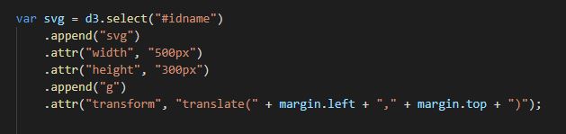
Try shrinking your screen and you will notice the SVG size is fixed and does not shrink down with the screen size.
Responsive SVG Format
What we do instead is move the fixed width and height outside of the svg and add attributes called “viewbox” and “preserveAspectRatio” to make the svg responsive to the screen size. So it will look like this instead:
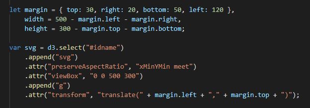
Try shrinking your screen and you will now notice that the SVG size retains its aspect ratio as it shrinks down with the screen size.
How it works
Viewbox:
This attribute makes the SVG graph responsive by defining a viewport with the origins of the x and y coordinates in the first two numbers, followed by the width and height in the last two numbers. So if we wanted a viewbox with zero x and zero y coordinates, a width of 600, and a height of 400 it will look like this: .attr(“viewBox”, "0 0 600 400”).
For the Utah Data Research Center's graphs, the first two numbers have always been zero since we start our graphs at the (0 , 0) coordinates. For the last two numbers, they are usually the same width and height numbers we listed outside of the SVG, but sometimes we have tinkered with other numbers to give it a different aspect ratio to enlarge or shrink the graph.
Preserve Aspect Ratio:
This attribute forces the uniform responsiveness for both the x-axis and y-axis within the viewBox. There are several different alignment attributes that can be used. For our graphs, we have always used “xMinYMin”. This means the smallest X of the SVG graph will align with the smallest X of the viewBox, and the smallest Y of the graph will align with the smallest Y of the viewBox. To view a full list of the alignment possibilities, visit here.