Visualizing Data with Seaborn
Skylar Scott, Senior Researcher
January 27, 2021

Seaborn is a data visualization package for Python. Within its library are solutions for traditional visualizations like bar plots, scatterplots, and histograms. Seaborn also has some data visualizations that I think are underutilized, like heatmaps, violin plots, and cat plots. If you are more familiar with matplotlib, do not worry, Seaborn works great with it. One of my interests outside of research is cars, so in this post, I will go through some useful visualizations with one of my favorite datasets, "autompg."
Auto MPG explores multiple variables like horsepower, mpg, and acceleration from cars produced in 1970 – 1982. The code for creating these visualizations is available in its entirety at the end of the blog. In the following text, I will show the code you might use to generate each of visualizations shown here. The dataset can be downloaded from Kaggle (https://www.kaggle.com/uciml/autompg-dataset) if you want to try some of the visualizations yourself.
One consideration car buyers are often interested in is fuel efficiency. Let us look at the fuel efficiency of this data set using Seaborn's kernel density plot (sns.kdeplot)
 #kdeplot

      sns.kdeplot(mpg_data['mpg'])

      plt.gca().yaxis.set_major_formatter(mtick.PercentFormatter(.1))
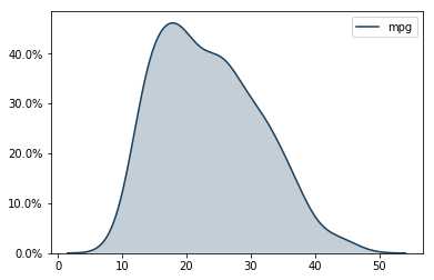
A kernel density plot is like a histogram that is smoothed out, which can remove some bin-bias. You can layer kernel density plots in Seaborn if you want to compare two sets of data. This data set distribution looks fairly normal. Most cars average around 19 or 20 miles per gallon. Our group's fuel-sipper is the Mazda GLC (the GLC stands for "great little car"), which averages 46.6 miles per gallon.
To better understand why a car achieves good gas mileage, let us look at the relationship between fuel efficiency and the number of cylinders in an engine. I will do this using Seaborn's swarm plot (sns.swarmplot).
 #swarmplot

      sns.swarmplot(mpg_data.cylinders, mpg_data.mpg, palette = custom, size=4, data = mpg_data)

      plt.xlabel('Cylinders')

      plt.ylabel('Miles Per Gallon')

      plt.title('A Swarm Plot of MPG Grouped by Cylinders')
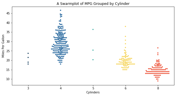
A swarm plot is useful for three reasons: distribution, count, and outliers. Considering distribution, you can generally see as cylinders go up, gas mileage goes down. However, four-cylinder cars tend to have a wider distribution. With the count, we observe most cars are 4, 6, or 8 cylinders. That is mainly because it is easier to balance primary and secondary forces in a running engine with an even number of pistons. Some outliers exist, especially for six-cylinder cars where European manufacturers used small-displacement v-6 engines at the time to achieve good gas mileage with a smoother ride.
Gas mileage is not the only thing a car buyer considers. Horsepower is a measure of output an engine can produce. After all, you may be happy getting great gas mileage, but you sacrifice a car's convenience and fun with a little power under the hood. A box plot (sns.boxplot) is used below to show the relationship between cylinders and horsepower.
 #boxplot

      sns.boxplot(x='horsepower', y='cylinders', orient = 'h', palette = 'pastel', data = mpg_data)

      plt.xlabel('Horsepower')

      plt.ylabel('Cylinders')
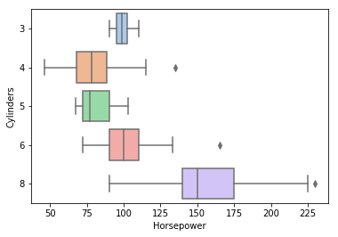
The colored box represents the 25th and 75th quartiles. The centerline in the box is the median. The whiskers represent values -/+1.5 times more than the endpoint of the quartile. A box plot can be used to understand the skew, distribution, and outliers in a data set. A general trend of higher horsepower with more cylinders is observed. The horsepower winner in this bunch is the 1971 Pontiac Grand Prix at 230 horsepower. Due to Nixon's new emissions standards during this period, along with the oil crisis, we do not see the power of the days prior to 1971 or today. We do observe some outliers as manufactures began mastering turbo technology and fuel-injection. So, some four- and six-cylinder cars from the early '80s can pack a punch.
Seaborn has too many tools to cover in one blog, but you can see a larger selection in this example gallery (https://seaborn.pydata.org/examples/index.html). Becoming familiar with these tools not only adds variety to your data visualizations but can help researchers and readers alike understand the data sets and models they work with.
 Created on Wed Jan 20 14:38:22 2021


      @author: skylarscott


      #load packages

      import pandas as pd

      import numpy as np

      import matplotlib.pyplot as plt

      import matplotlib.ticker as mtick

      import seaborn as sns


      #read data

      mpg_data = pd.read_csv(r'C:\your path goes here\auto-mpg.csv')


      #ensure data read in correctly

      mpg_data.head()


      #create a custom color palette put in any colors you'd like

      custom = sns.set_palette(sns.color_palette(["#5ebcd2", "#501b73"]))

      #swarmplot

      sns.swarmplot(mpg_data.cylinders, mpg_data.mpg, palette = custom, size=4, data = mpg_data)

      plt.xlabel('Cylinders')

      plt.ylabel('Miles Per Gallon')

      plt.title('A Swarm Plot of MPG Grouped by Cylinders')


      #kdeplot

      sns.kdeplot(mpg_data['mpg'])

      plt.gca().yaxis.set_major_formatter(mtick.PercentFormatter(.1))


      #boxplot

      sns.boxplot(x='horsepower', y='cylinders', orient = 'h', palette = 'pastel', data = mpg_data)

      plt.xlabel('Horsepower')

      plt.ylabel('Cylinders')