New Data Narrative Designs Based on User Needs
Laura Dahl, PhD, UX Researcher
July 7, 2021
The Utah Data Research Center researches Utah’s P20W pipeline (employment, education, and health). Our researchers are in a unique position to have access to data from several state agencies, so they can conduct meaningful research to inform public policy initiatives, providing the platform for policymakers, practitioners, and the general public to make data-informed decisions.
In addition to posting the full report for each research project that UDRC does, we publish summaries that include data visualizations, known internally as data narratives. It is my job to design and create each data narrative. I work closely with UDRC researchers to communicate the findings effectively.
Effective data narratives are essential to make our research findings accessible to a diverse group of people. For example, our data narratives need to be readable for policymakers, scholars, and anybody interested in our findings of Utah employment, education, and health. Additionally, the narratives need to be accessible through multiple devices, including mobile, tablet, and desktop computers.
I recently did usability testing with policymakers, scholars, and those interested in the information on our website. Many of the updates on our website at https://udrc.utah.gov reflect the feedback I received from these interviews. The most frequent request regarding our data narratives was to make the pages easy to read and formatted for multiple reading styles.
- Policymaker participants sometimes wanted just enough information to have talking points when making decisions and writing laws.
- Some participants sometimes wanted to find information to read selectively.
- And sometimes, they wanted to read the entire data narrative and report.
New Data Narrative Design
I worked on a new design for our data narratives, as in Figure 1, that is meant to meet our users’ needs and expectations better. For example, the design includes readability for skimmers, scanners, and in-depth readers:
Skimmers would read the findings in the overview, headings with a summary of the results, and callouts of the primary conclusions. Doing this would enable policymakers to have talking points about our conclusions. Skimming is probably the most common method that website visitors use on a content-heavy web page. Reading in this way would allow these folks to get their toes wet in the ocean of information.
Scanners are not interested in dealing with all the content, but they search for a specific purpose or word. For example, they might want to find the answer to a question about a specific high-level finding, so they would look for and read all of the relevant results within a particular section on the page. This reading type is akin to snorkeling in the ocean.
In-depth readers are the most involved and seek to understand the concepts and arguments contained on the page. These folks would read every bit of the text and graphs, and some might read through the full report in PDF format. This reading type is akin to SCUBA diving deep into the ocean of information.
Because we need to support all device sizes, this new design is mobile-first, using Bootstrap’s responsive grid system. Additionally, this design integrates improved accessibility through Bootstrap’s interface and adding our accessible elements.
The following image is a partial view of the new design we are using for our data narratives.
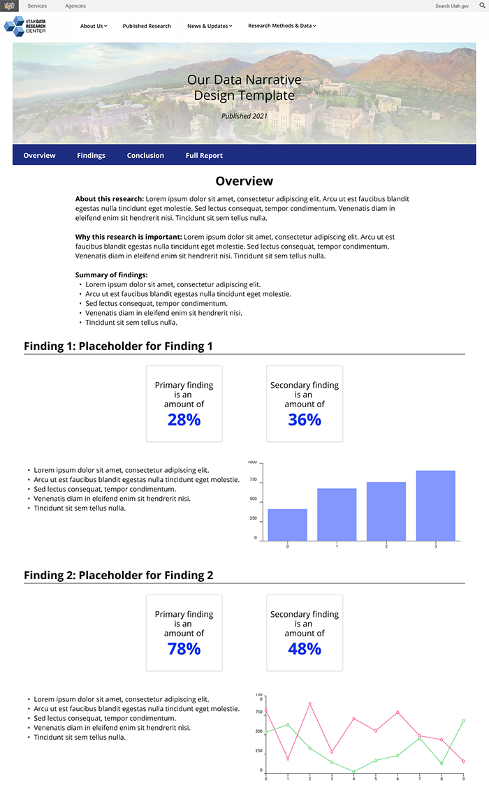
This new data narrative design will be used for upcoming, published research reports. The design is based on user feedback from usability tests done earlier this year. I created this design template to share with our researchers, and it will help them understand what expectations we have for writing the text for their online data narratives.
I am interested in doing more usability tests on our upcoming and new data narratives, in addition to receiving feedback on our updated website. If you are interested in giving feedback over a 30-minute online meeting, please email me at udrc@utah.gov.