The AUC-ROC curve
Karen Tao, Researcher
April 7, 2021

We have previously reviewed the concepts of confusion matrix and precision and recall thresholds for probabilistic models and true positive rate (TPR) and false-positive rate (FPR). We now have all the tools needed to connect the dots, literally, for our AUC-ROC curve. This blog is part 3 of a series on accuracy measures for classification machine learning. Please be sure to review the previous two posts to refresh your memory:
Recall that our task is for the classifier to predict whether my niece likes a particular gift. We gave a small sample of 10 gifts in the last blog post. We saw that choosing different threshold values could drastically change our confusion matrix and, consequently, change the TPR and FPR as we look at the classifier's different thresholds. When we plot the TPR and the FPR for each of the threshold values with TPR on the y-axis and FPR on the x-axis, the result is the Receiver Operating Characteristics (ROC) curve, a term from signal detection theory. Keep in mind that TPR and FPR are fractions. Both TPR and FPR range between 0 and 1. Figure 1 demonstrates an example of two plotted ROC curves.
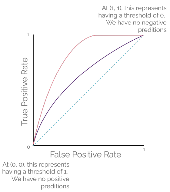
When we set the threshold of our classifier to zero (blue outline), as seen in Table 1 from my last post, all gifts would get classified as "liked" regardless of the ground truth because all predicted probability values can cross this low threshold. Our TPR would be 1 because the model is not predicting "no," so we have zero false negatives. Our FPR would also be 1 because we would also have zero true negatives. Our model is simply not predicting "no" at all. In this case, we plot a point for our ROC curve at (1, 1). This point represents the extreme case of predicting all gifts as "liked." We are committing a Type I error.
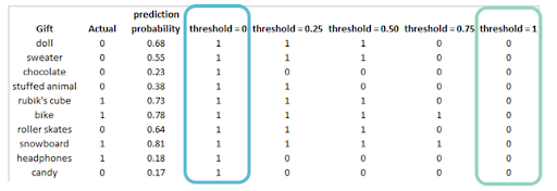
Now let us look at the threshold value of one from Table 1 (green outline) from my last post. All gifts would get classified as "not liked" regardless of the ground truth because none of the predicted probability values could cross this high threshold. Our TPR would be 0 because the model is not predicting "yes," so we have zero true positives. Our FPR would also be 0 because we would also have zero false positives. Our model is simply not predicting "yes" at all. In this case, we plot a point for our ROC curve at (0, 0). This point represents the other extreme case of predicting all gifts as "not liked." We are committing a Type II error.
When we draw a straight line connecting these two extreme cases, the result would be a diagonal line, on which TPR and FPR have the same values. This result is represented by the teal dotted line in Figure 1. At any point on this line, the proportion of the correctly classified "liked" is the same as the proportion of the incorrectly classified "not liked" as FPR = TPR (x = y). This model may make random guesses as its prediction.
As we change our classifier's threshold values, we get new points to plot to represent different TPRs and FPRs. Once we are done, we can connect those points to form the ROC curve. The purple curve and the coral curve in Figure 1 are examples of ROC curves. The area under the curve (AUC) measures the ability of a classifier to distinguish between "yes" and "no." At its maximum, AUC would be a perfect square with an area of 1, which is the maximum possible value of TPR times the maximum possible value of FPR. This predictive AUC curve occurs when the classifier can perfectly distinguish between all the "yes" and "no." The AUC value for the teal dotted line from Figure 1 would be 0.5, and that may represent a model that is making random guesses.
Visually, the model performs well when the ROC curve hugs the top left corner of the plot. The AUC value for the coral curve in Figure 1 would be greater than the AUC value for the purple curve. We can easily see that the area under the coral curve is greater than the area under the purple curve. Intuitively, a curve-hugging the upper left corner of the plot represents the case that the model can achieve high TPR while keeping FPR low at the same time.
The advantage of the AUC value is that it considers all possible thresholds of our classifier, as various thresholds result in different true-positive and false-positive rates. The ROC curve is such a popular visualization tool that you may see it in many data science academic publications. So, it is important to understand how to implement and interpret the curve correctly. In python, check out the 'sklearn' library 'roc_curve' and 'roc_auc_score' modules. In R, check out the 'pROC' package. Happy coding!